Programme
Time Monday 31st October | 3 to 5pm
Location CERN, 28-S-029
Dashboard visualizations

Data Loading

Data Cleaning

Crossfilter

DC.js
Styling
Dashboard Visualizations
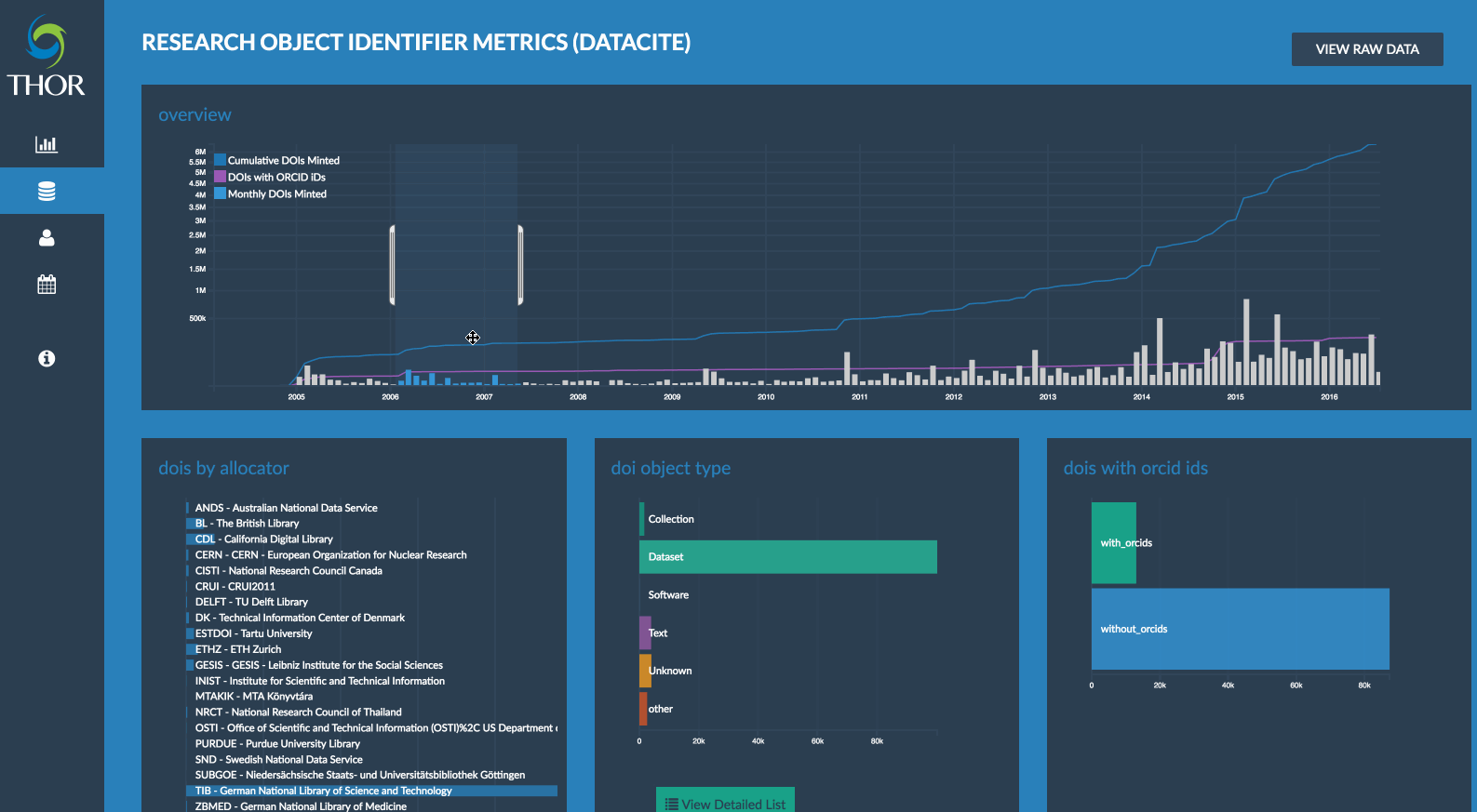
Dashboard visualizations are useful when we wish to piece together lots of related pieces of information together
For instance, the THOR dashboard provides the functionalities to interactively query and visualize data sets which would normally have to be carried out manually.
Data Loading
    # we load the CSV file using D3, which takes the file name, and a callback function as arguments.
    # since we don't know how long it will take for the file to be returned, callbacks are our way of
    # calling some code only when a result is returned.

    d3.csv('/assets/data/house_sales.csv', function (data) {
        // result will now automatically have a JSON representation of the CSV file we've just seen.

        // let's check our console in our browser to see the content of house prices.
        console.log(data);
    }
Our first exercise will look at some loading a simple CSV file on house sales in to our browser.
Data Cleaning
Next is data cleanup or wrangling, which is a key and often tedious part of statistics and/or data visualization
Many data cleanup tasks can be performed quickly just some with some additional JavaScript, as we'll see in the next coding part of our exercise.
Common tasks include parsing dates correctly, fixing numeric encodings, tidying up values (e.g. different ways of talking about the same thing are not good), etc.
However, for bigger datasets, tools such as Trifacta can be useful in helping clean your data.

Our next exercise (Ex. 2) will look at some simple data cleaning operations.
Crossfilter
To use dc.js, we need to define what are called dimensions (e.g. dates, the county, number of bedrooms),
and groups, which are generally just counts of the number of times a value occurs.
This is an operation termed map - reduce
    /*
    * We load the CSV file using D3, which takes the file name,
    * and a callback function as arguments.
    * since we don't know how long it will take for the file
    * to be returned, callbacks are our way of
    * calling some code only when a result is returned.
    */

    d3.csv('/assets/data/house_sales.csv', function (data) {
        // data will now automatically have a JSON
        // representation of the CSV file we've just seen.

        var housePrices = crossfilter(data);

        // we define our first group, which will be the sales
        // by date, so we create a new 'dimension' that will
        // focus on the date field.
        var salesByDate = housePrices.dimension(function (d) {
            return d.date;
        });

        // this operation will simply count the number of
        // records we have for each unique date.
        var salesByDateCount = salesByDate.group();

        var price = housePrices.dimension(function (d) {
            return d['Sale Price'];
        });


        // We can also filter things, like filter my dimension by
        // the price, where our price should be greater than 300 and
        // less than 600 (1000s)
        var filteredPrice = salesByDate.filter(function(d) {
            return d > 300 && D < 600;
        });

        // We can then see the top results on our filtered dimension for instance.
        console.log(filteredPrice.top(1));

        // ...
    }
Our next exercise (Ex. 3) will look at creating some dimensions and groups from our data.
DC.js
Assuming we've added crossfilter, dc.js, and d3.js to our document, we can now create a chart
    var housePrices = crossfilter(data);

    var salesByDate = housePrices.dimension(function (d) {
    return d.date;
    });

    var salesByDateCount = salesByDate.group();

    // #salesChart is an id to a div we want to put the
    //
    var salesChart = dc.barChart("#salesChart")
        // this is optional. You can also specify the width,
        // colours, etc. but we'll do that later
        .height(200)
        .x(d3.time.scale().domain([minDate, maxDate]))
        .dimension(salesByDate)
        .group(salvesByDateCount);

    dc.renderAll();
Our next exercise (Ex. 4) will look at creating some simple charts from our data.
Styling
A key part of a nice interface is the style. By default, dc.js has a basic style, and a default colour map. You should change these colours and fonts to match your style.
Whilst choosing colours is often difficult, there are many tools to help you pick better colour schemes such as colorbrewer2.org, colorgorical, and colour map hospital.
You can also see really beautiful colour palettes at FlatUI colors, and color lovers.
I also recommend toning down the axis lines and labels to make them less distracting.
Contact Us
Want to know more about dc.js, crossfilter, or d3.js?
They have plenty of resources on their site, and many examples.
You can also email me for any additional information.
Links
Crossfilter.jsD3.js
DC.js